See the bigger picture.
School, academics, research, and student life pages introduce the college and give visitors a starting point.
NORTHEASTERN UNIVERSITY / BOUVÉ COLLEGE OF HEALTH SCIENCES
A college website has to do more than explain an institution. It has to help someone see where they fit—and find the information to take their next step.
My work for Northeastern University’s Bouvé College of Health Sciences brought together UX/UI design, page building, content, and accessibility.
From the first look to the program details.
WHY IT MATTERS
A prospective student looking for a program needs a different route from someone exploring research, finding a faculty member, or checking an event. The Bouvé website brings those needs into one institutional experience.
School, academics, research, and student life pages introduce the college and give visitors a starting point.
Program, person, article, and event templates create more focused places to find information.
WHAT I WORKED ON
My contribution spanned UX/UI design, refining existing designs, building pages, and working on content and accessibility. It meant considering both the visual experience and how the pages would work in practice.
I worked on page layouts and refinements, considering hierarchy, consistency, and how visitors move through information.
I helped carry design decisions into page building, connecting the intended layout with the content it needed to support.
I worked on content and accessibility alongside the interface, treating clarity as part of the overall experience.
DESIGN DECISIONS
The page designs connect broad entry points with detailed academic information. Repeated program finders, content cards, and next-step sections create recognizable patterns across different parts of the site.
The homepage and school layouts repeat a “Find your program” module. Degree-level choices and filters give visitors a recognizable starting point as they move from the college to a more specific area.
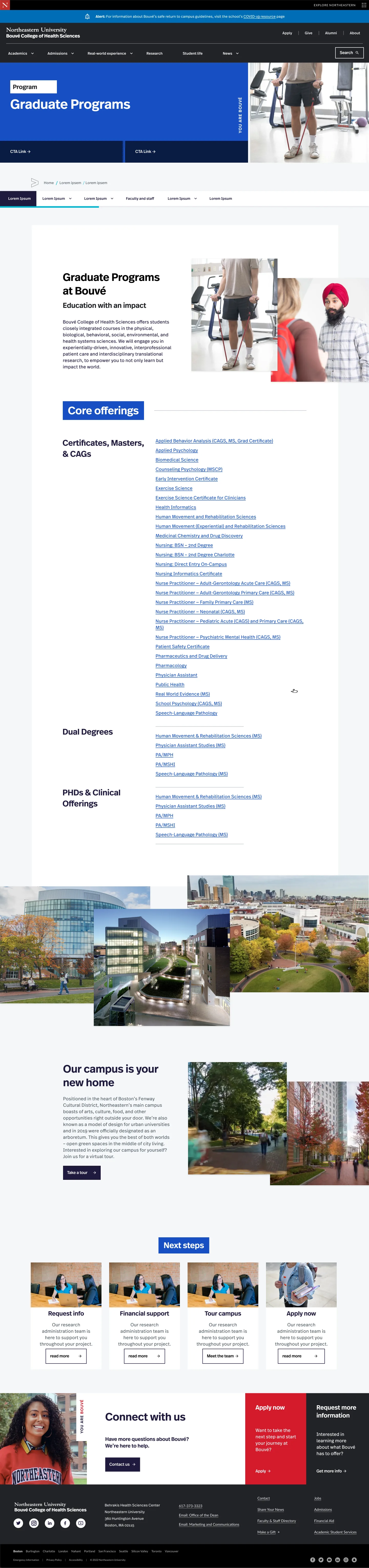
See the homepage design ↗The individual program layout groups application deadlines, admissions requirements, degree options, and curriculum into distinct sections. Local navigation and expandable content organize the longer page.
See the program design ↗Admissions, research, and program layouts each include next-step sections. Those groups bring actions such as requesting information, applying, or connecting with the college into the same visual pattern.
See the admissions design ↗RESPONSIVE CONSIDERATIONS
The file includes mobile card explorations and a smaller homepage layout. Those explorations make an important trade-off visible: keeping useful content available while adapting the layout to a narrower viewport.
THE WEBSITE / EIGHT PAGE DESIGNS
Explore the page designs below. Open any page to see the full layout, including the content, navigation, and calls to action.







CLOSING THOUGHTS
This work sits at the intersection of design, implementation, and content. A page’s usefulness depends on how those pieces come together: what it emphasizes, how it reads, and how people can interact with it.