“What am I missing?”
Rent, amenities, commute, and neighborhood information can be difficult to piece together across platforms.
DOORMATE / UX CASE STUDY
Helping Boston students explore housing, understand the details, and learn from the people who lived there before them.
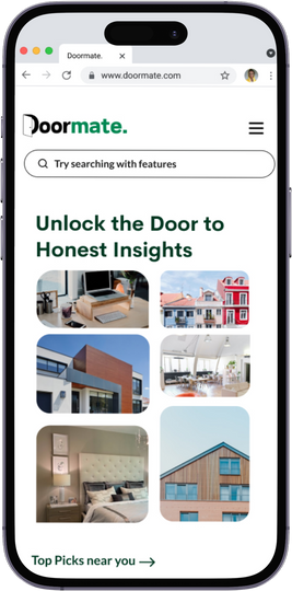
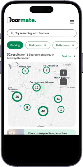
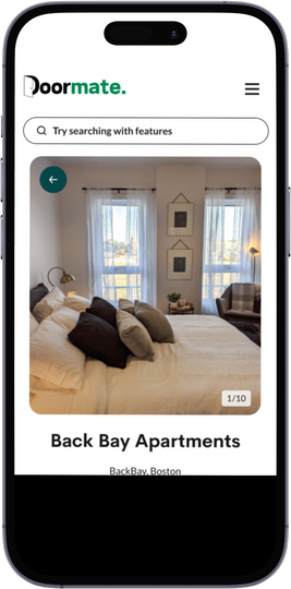
Explore the neighborhood. Look closer. Hear from tenants.
01 / THE CHALLENGE
Moving to Boston puts students in an unfamiliar rental market. Listings are scattered, budgets are tight, and important details can surface only after moving in.
Rent, amenities, commute, and neighborhood information can be difficult to piece together across platforms.
Cleanliness, maintenance, and landlord responsiveness can change how a place feels to live in.
Illustrative prompts based on the project’s problem framing, not direct interview quotations.
02 / LISTEN BEFORE DESIGNING
The project used student surveys and interviews, alongside conversations with people in real estate and hospitality. Personas, a journey map, and affinity mapping organized the needs that emerged.
Students weighed the cost against amenities, maintenance, and the quality of landlord service.
Commute, quiet, social opportunities, and price created trade-offs that a listing alone couldn’t settle.
Accurate information and candid tenant reviews could help surface issues before a commitment.
Qualitative themes summarized from the deck. Participant counts and measured usability outcomes were not reported.
THE DESIGN QUESTION
Bring property details, location context, and tenant experiences into one place so the search supports comparison rather than guesswork.
03 / MAKE THE JOURNEY TANGIBLE
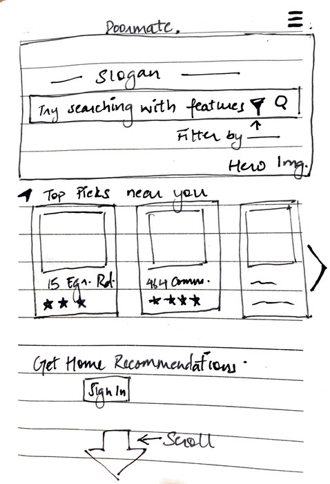
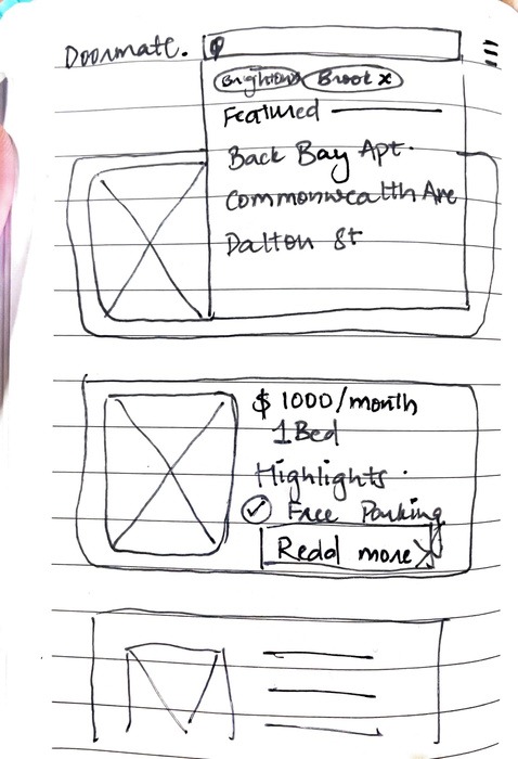
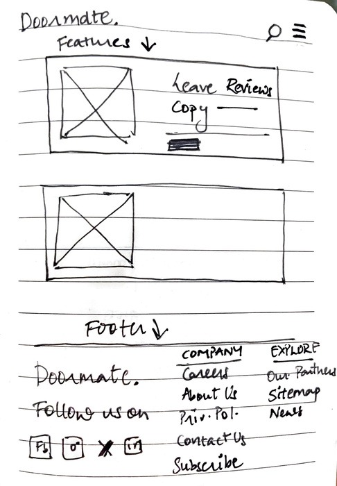
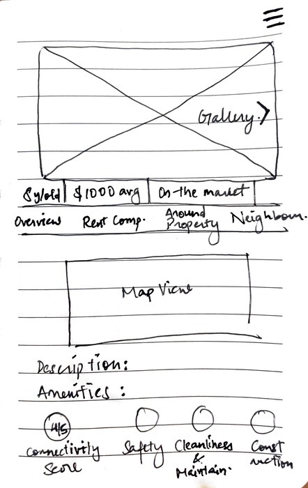
Original solution sketches from the project.
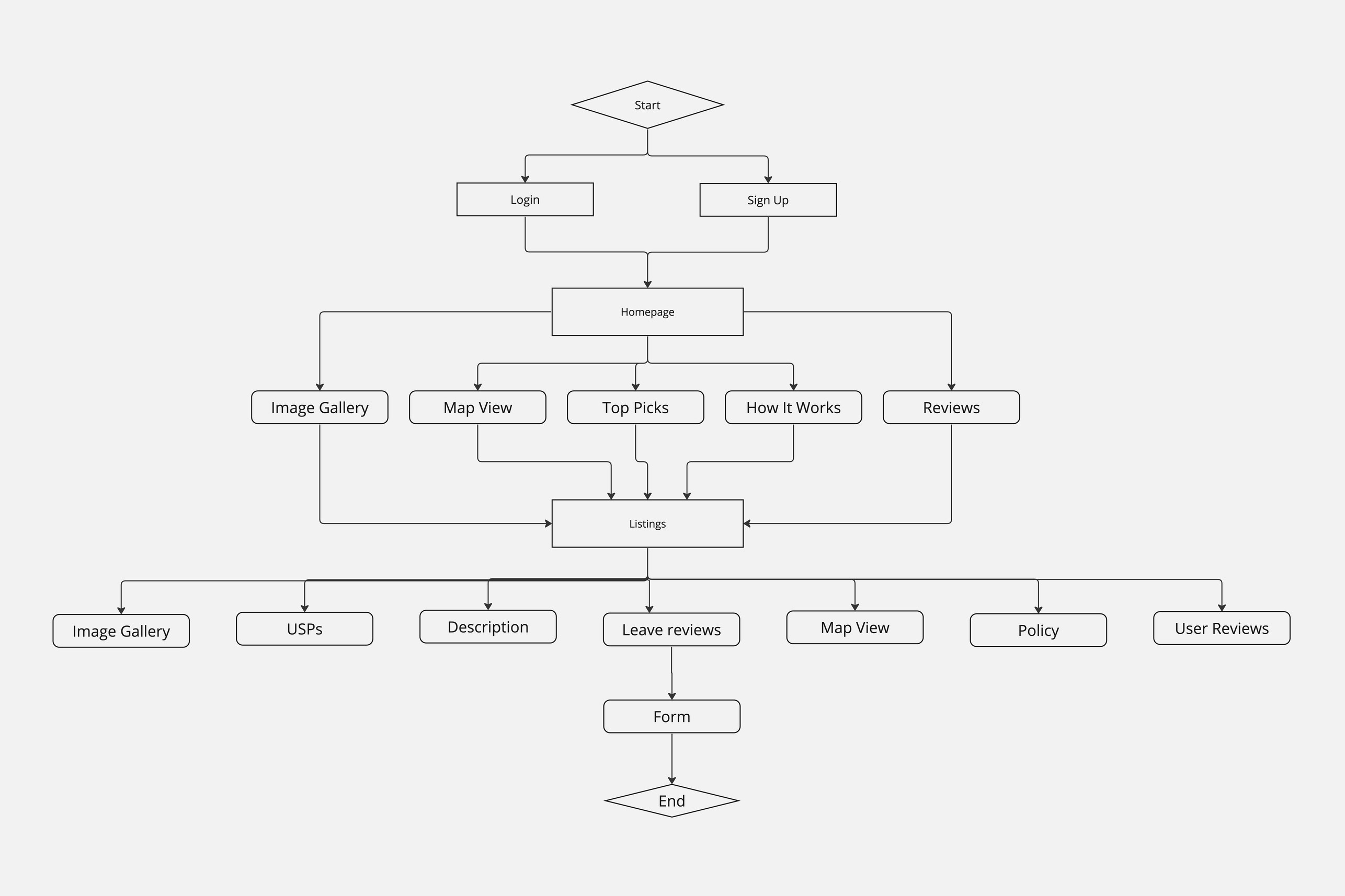
04 / THE EXPERIENCE
Gallery and map views offer different ways to explore housing. Search and filters help narrow the options around what matters to the student.
Cognition lens: the map makes location relationships visible, while listing cards give people a consistent way to compare options.
Property pages combine images, price, location, bedrooms, amenities, and tenant reviews. The goal is to reduce the need to piece a picture together elsewhere.
Cognition lens: keeping related information together can support comparison without relying on memory.
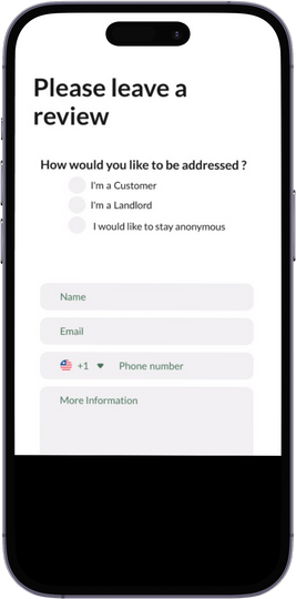
Explore the full property screen ↗A review form combines ratings and written feedback, with an option to remain anonymous. Tenant perspectives add context that property descriptions may leave out.
Question to test: what would help students trust a review while protecting a contributor’s privacy?
05 / VISUAL LANGUAGE
A door-inspired identity, green accents, and soft neutrals give Doormate its own visual language. Cerebri Bold and Lato form the original type palette.
06 / REFLECTION & NEXT STEPS
Doormate turns the research themes into a housing and reviews concept. The next step is to test whether students can compare homes, find relevant details, and judge the usefulness of reviews.
Observe students finding a home within a budget and identifying the details they need before enquiring.
Explore review verification, moderation, and privacy before treating a review system as trustworthy.
The deck proposes virtual tours, scam detection, richer profiles, and chat as future directions—not existing features.